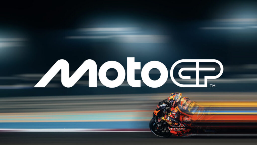
MotoGP unveiled its revamped logo at the 2024 season finale in Barcelona, marking a major shift in the championship’s visual identity ahead of 2025.
The iconic chequered flag logo, which represented the sport since 2002 and was last updated in 2007, has been retired. The fresh minimalist design comes from Pentagram, a leading independent design studio, as part of a comprehensive brand refresh by Dorna.
The new logo features an ‘M’ shape inspired by two motorcycles cornering close together, with the ‘O’s representing wheel geometry, and the ‘t’ symbolizing a rider. The ‘GP’ is designed to mimic a racetrack layout.
This update goes beyond just the logo, extending to a complete overhaul of MotoGP’s visual identity, including artwork, motion graphics, typography, and the redesign of logos for Moto2 and Moto3, which now follow the same design language as the premier class.

“This is a big step for MotoGP, and we’re excited for fans to experience our new identity,” said Carmelo Ezpeleta, CEO of Dorna. “It’s not just about a new logo. This refresh represents the passion, speed, and future vision of our sport.”
The brand update coincides with Liberty Media’s imminent acquisition of Dorna, expected to finalize regulatory approvals by the end of 2024. Liberty previously revamped Formula 1’s brand in 2017 following its own takeover.
